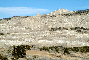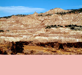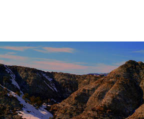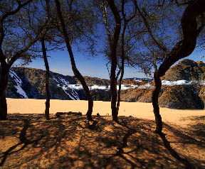
Original image shot in Utah. This image has a great deal of depth and could be found anywhere in the world. Although it is very monochromatic I thought it was the perfect choice for the idea I had.
|

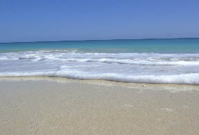
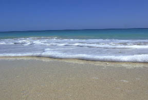
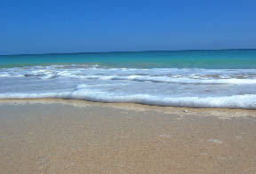
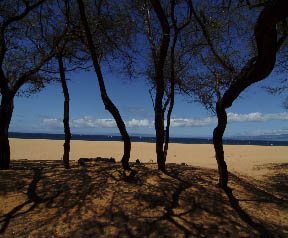
Original image shot on the island of Barbuda.
|
|
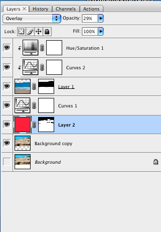
Final layer palette for the project. The two top adjustment layers are indented, which means that they are attached to the ocean image layer only. Layer 2 is a filled color layer set to "Overlay " in the blending mode and has a curves adjustment layer attached to it for pop. A mask is applied to the red layer to remove its effect from the sky area.
|

Curves adjustment layer fine tunes the exposure.
|

Hue saturation adjustment layer adds a slight punch to the colors.
|

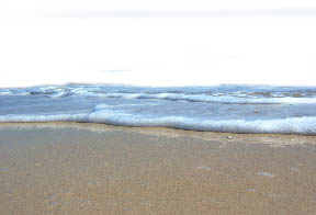
First the canvas was enlarged also to accommodate the space needed for the rock image. Then I added a mask to the water layer to remove some areas so the rock would show through.
|

Water layer with the mask added.
|

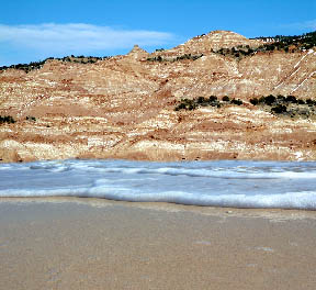
I added space to the bottom of the canvas yet again, increasing its overall size so I could place the ocean in a specific place. Despite the fact that I have converted this image to meet Web color standards, it does not look like the image that I have designed. The rocks have a red cast to them and the water is turquoise blue. They say that working with color variations and printing is the hardest challenge for any artist using a computer. This proves that statement right.
|

Is the image believable? Maybe I should show you the finals first and then how it was done. This final image represents the true colors. The one to the right was on the proper setting. After looking at this again I have decided that I created it to show something that does not really exist in life. It is meant to challenge the viewer's concept of reality.
|
The images below would not normally be seen together, and for that reason making the blend work was rather difficult. Below I have shown you the two images that I used and the final image. I also included the layers palette so you have an idea of how involved it was to create. In fact I have worked on this image on and off for about 3 weeks. Why would I make an image like this? The answer to that is simple. I want to grab the viewer’s attention. To show them something that they would question and to provoke interest. You may be asking me, Why do you want to provoke the viewer’s interest? I have always thought that if I can stop any viewer long enough to create in the viewer’s mind questioning and curiosity about my work, then I have made a successful image.
|
 |
 |
 |
 |
